As I mention before, we wanted to promote our movie. Just to create some buzz, and make people wait for something good, and make them interested.
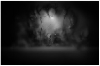
It really started in some of the early weeks of the project when we was drawing the storyboard and put together the animatic. We said that it would have been awesome to put up posters and make people come watch our movie. We had a nice little chat about it, and said that the scene where the smoke is coming up behind the girl would make an awesome movie poster. But as this was so early in the process, we left it with that.
It really started in some of the early weeks of the project when we was drawing the storyboard and put together the animatic. We said that it would have been awesome to put up posters and make people come watch our movie. We had a nice little chat about it, and said that the scene where the smoke is coming up behind the girl would make an awesome movie poster. But as this was so early in the process, we left it with that.
When the animatic was done, our teacher wanted us to post it up on the wall of the official 3d Animated 3d Short Film Production Group at facebook (http://www.facebook.com/#!/group.php?gid=390718338616). Already then, we discussed on what to write to get people to comment it and make sure they watch it.
So we when we started to get into the movie, and started to come up with some renders, we decided that we wanted to make WIP post at a Norwegian 3d forum, www.3dhue.com. We wanted to this for 2 reasons; one was that we wanted critique and comments on work, so we could improve certain areas of our movie, and the second reason was that we want people to know that we are making something awesome.
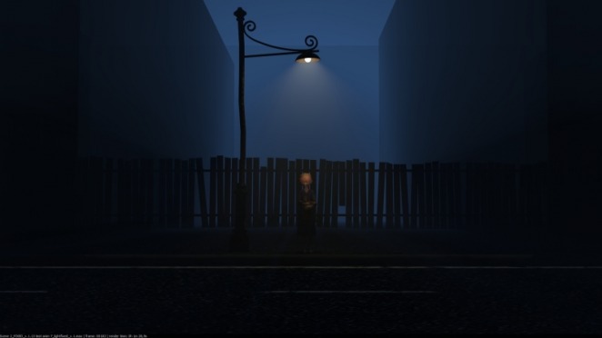
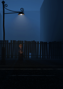
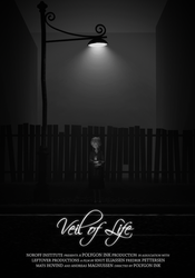
This is where the movie poster comes into the picture. With the post, we wanted to make a movie poster that could catch people’s eyes, but not reveal the story. We want them to want more and more. Although we hadn’t made the smoke for the scene yet, we still wanted the scene where she is standing under the light. It’s a scene that tells a lot about the style and the story.
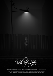
I rendered out a frame from the scene. I picked a pose where she looks down, and looks very sad. Like she is lost. I thought that described our story good and gave out a mystic vibe.
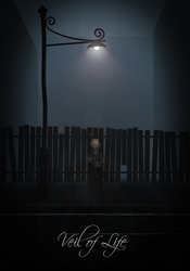
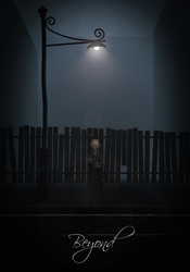
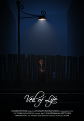
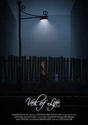
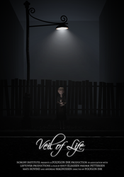
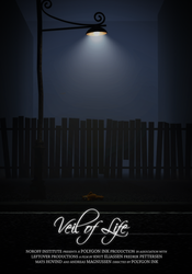
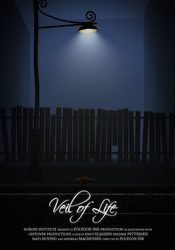
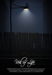
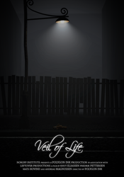
At this moment, we hadn’t decided the name. So I went into photoshop and took one with each of the remaining choices we had. I hoped that this would help us chose the name. Of course I did some color corrections at the rendered image. That’s the fun part.
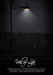
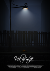
Here is what I ended up with as first drafts.
Here is what I ended up with as first drafts.
I posted them at our production forum, and got some feedback from our teacher. He wanted me to change some small things. I love to get critique and advice from people that have worked in the business for a long time, but I am not always going to follow them. I have to trust my instinct sometimes.
Here is what he wanted me to change:
The Font. He meant that this could be hard to animate if we wanted so. I thought that this font was perfect for our type of movie. It’s nice looking, clear, and as something elegant over itself. A big contrast from our movie. And if we want to animate it, I can manage that. So I decided that this would not be changed.
Too Centered. He meant that the composition was too centered. I feel that a poster should be centered. My opinion is that it looks weird if something is offset. I did a small test just to see how it looked, and I was not that happy. I tried to imagine if the text was put at the side of the girl, could have looked ok, but nothing more than that. So this would not be change either.
Bottom Text: He wanted me to have a text at the bottom that is at the professional movie posters. And I totally agree, it would take the poster up a notch, and look better.
Too far away: He meant that the girl was to large away and we could not see all of the details. I agree at that point, but that was some of the plan behind this. I want it to be a bit mystic, and that something should be blurry and unclear. Let them guess a bit.
The flare: He wants me to remove it. I agree. It was a last minute effect that I threw on there. Although it looks cool, it doesn’t fit into that setting.
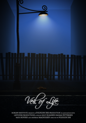
So I went back and started editing one more time. I tried some different styles.
The flare: He wants me to remove it. I agree. It was a last minute effect that I threw on there. Although it looks cool, it doesn’t fit into that setting.
So I went back and started editing one more time. I tried some different styles.
Personally I like the one with the most colors. But that’s because I like lights and colors. A bit more de-saturated version would be better for our purpose I think. When it comes to the black and white’ish, I think it got a bit boring. The eye would just glance over it, not stop and look at it.
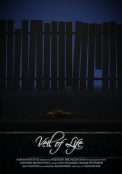
I still felt that something was missing, and I just couldn’t put my finger on it. Then I got the famous light bulb over my head and came up with an idea. What if I removed the girl, and let the teddy bear be the centered of attention. That would be really creepy. Many questions could pop up in people’s minds.
Once again I rendered out a frame, this time I had to animate the teddy bear into position. I rendered the frame so big that I could try out different sizes for my final comp.
I made a couple tests, and found out what size I wanted, and then I started the editing process again. I had to make the teddy bear a bit more visible, so I lighted it up by copy some layers and change the layer blending mode. This is what I ended up with.
And the one we chose was this one:
I am really happy with the result. If no one had ever heard of our plot or seen anything else from it, I think that they would get really interested just because of the teddy bear lying there. The blue volume light gives a really creepy feeling that just is perfect for our movie.
If I was going to make some changes, I think I might have put the Title somewhere else. Possible at the top. I think that it is a bit much at the bottom.
To sum this chapter up, I want to write something about me as an artist. Because as these weeks has past, I have discovered new things about what I like, and what that is driving me against a finished animation, poster or image for that sake.
I have become more and more aware of that I really like things to be clean. I don’t love all that knickknack that can be thrown on some images. The colors also need to blend into each other, or have a big contrast. You need to think colors all the time in other words. And that’s why I think I am so fascinated by movie posters or advertisement. They are often clean, and really neat to look at.
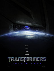
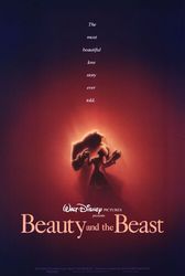
Let’s take some movie posters.
These two are a good example from what I like. So clean and just beautiful put together.
Beauty and beast poster is a work of a genius. It so amazing how they have they have composite this together. The blue outer ring has huge contrast to the red middle ring, and inside there again, you got the yellow glow that is the light hitting them. All of this is guiding your eyes right at the two characters, and you can clearly see what they are feeling for each other.
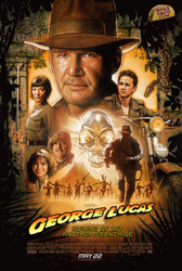
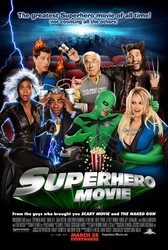
The next two examples are example of what I do not like. Too much happening in the picture, you don’t know where to look.
Discovering these things lets me be more aware of what mistakes I can make. Because when I first love clean compositions, I can start doing it all the time. So I need to be able to find out when I need to do what so I don’t start doing only clean compositions.
That’s it for today.
That’s it for today.



 RSS Feed