This post was meant to be one post, and I know I have said that I wouldn’t divide my posts up into smaller parts. But I am going to do that now. Not because I am doing it to make sure I get my 17 posts, but because it will get much more clear and tidy for the reader out there and the post had been extreme long if I did not divide it up. And every part of this post fills my own standards of a good post so I do not feel that this will be a problem.
I have divided it up into 3 parts and each part has a ending where I try to explain and reflect on what I have learned from those things that have been written about. Part 1 is about why we brought this teddy into the story, and about collecting the references. Modeling and Texturing will be in Part 2, while rigging will be in Part 3.
PART 1.
Why a companion?
We haven’t really discussed this very clearly in our group, just some lose thoughts around it, but I want to share what I was focusing on when we chose to bring in another character into the story. Because it is loads of benefits when we bring in another character into the stage. You get a whole new element that can change the story, and give the story better turning points.
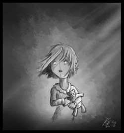
First, why a teddy bear? This is maybe the easiest question. By making the companion a teddy bear, we make the girl much cuter. She gets much more character of having a little teddy bear at her arm. And it does make the story a bit more believable. Every kid at some stage in their life is very addicted of having a toy or a teddy bear with them all the time.
She can hold her teddy tight when she is scared. We can have her show more emotion with the teddy, than we could without. And when she runs with the teddy bear, it will swing back and forth so we get a dramatic feel.
The biggest reason of let the girl have a companion in the story was that we felt that the story was not strong enough. It needed a dramatic situation. We needed a reason for her to stop up and confront the smoke monster that is following her. When she loses the teddy, she needs to go back and pick it up. We get a whole new element of excitement in the movie.
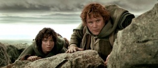
Many movies lets the main person get a companion that are being used throughout the movie to tell the story better, and bring in scenes that you couldn’t have without them. If you take Lord of the rings for example, you can see how they used Sam. Frodo get a traveler companion that make’s Frodo have to go back and help Sam out and opposite. The friendship between Frodo and Sam grows throughout the story, but later on they are being split up by Golum, but Sam still go back to help Frodo when he is taken by the orcs. It’s nice to see how different movies use persons to tell the story better, and think I can learn a lot from that when I am going to make a new movie sometime in the future.
References.
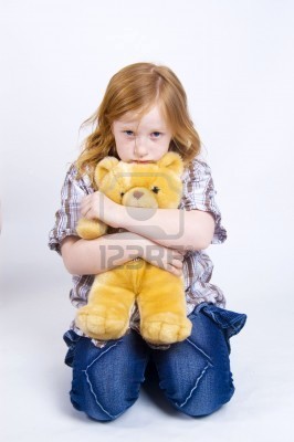
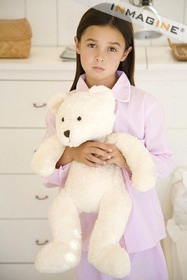
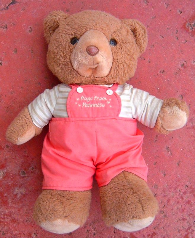
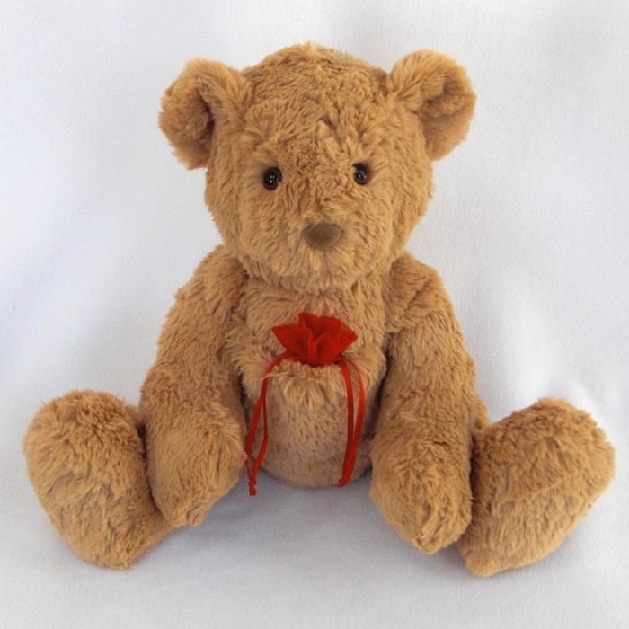
We started with searching after references all over the internet. It was loads of pictures there, so it got our brains working. Who knew it were so many different types of teddy’s out there? These are some of the pictures we found in the start:
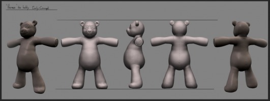
These didn’t quite strike our hearts to say it like that. Too find out what type of teddy we wanted, we needed to know how the teddy was supposed to be treated, and what it should be doing in our movie. His owner runs a lot, so we wanted him to have a slim body, with thin arms and legs. So his limbs could be thrown around a bit to get that dramatic effect.
As you can see from some of the first concept for the movie, Knut had already thought in that direction. To get some measurements, I took a look at some of the teddy bears that my mum has bought throughout many years. We found out that about 40 centimeters would be a nice length for the teddy.
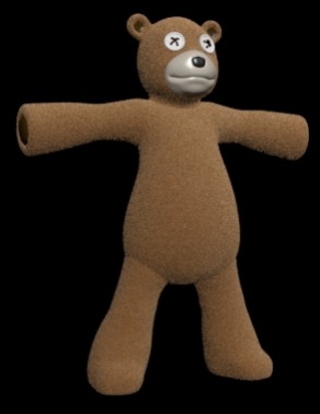
We didn’t really need a name for this character, but we kind of started talking a bit about it, and Fredrik come up with Herman. From there it weren’t a long way to “Herman the Teddy Bear”. So now it had a name too.
Experience:
I didn’t feel that I really learned a lot from the collecting references part. It’s basically the same as I have done loads of times before. The one thing I learn, was that I should look around in the house for real references before I go onto the internet. Better to have them in my hand than on the computer.
The most interesting thing about this part is that I look at characters in movies in a bit different way. I try to see how they are being affected by the others around them, and try to think how it would have been without them.
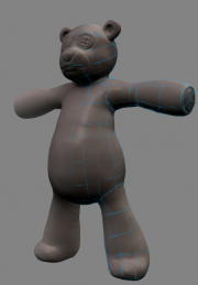
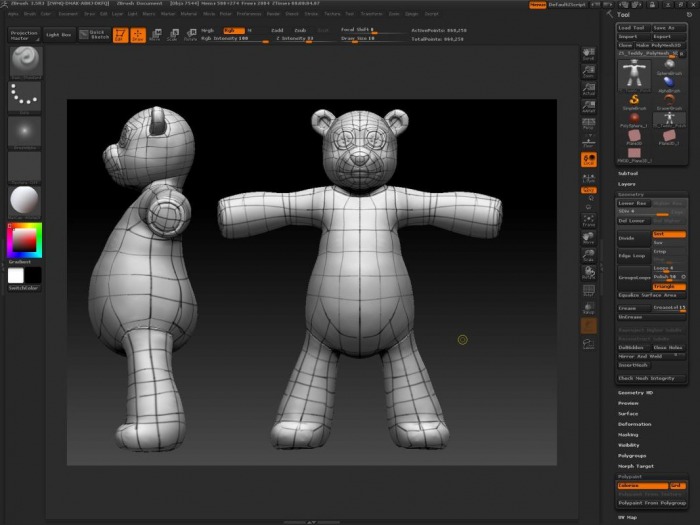
Next step along the way was to model this character. I was so happy that I was given that task. I have only made one character before, so this was a great opportunity to get more experience in modeling and rigging. Before I could start, I needed some drawings to speed up my modeling. Knut said he could take care of it, and he did. He modeled the concept in Zbrush so I could us those renders as guidance references. I took the left and front picture and lined them up and I was ready to start modeling.
Zbrush concept by Knut Eliassen
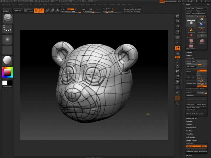
After a day, I was really happy with my progress. But, I hadn’t taken in consideration that this teddy bear was going to have some heavy animation. The polyflow was not good. Simple as that. I got a tip that I should draw the poly flow on top of the concept pictures. So I did that, and started to model it from the start again.
Early thoughts for polyflow
I showed the model to Knut, and he saw it and told me that it wasn’t what he called optimized. He asked me to model the bear again. At that point, I got a bit pissed to be honest. This teddy was my worst enemy at that point and I hated it big time. But then Knut told me that he would help me. 2 hours later, he had drawn on the polyflow inside Zbrush. He saved the day.
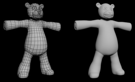
And, no one mentioned to me that I could import that Zbrush model into max, and then use the new polyflow toolset to model on top of the Zbrush model. Hallelujah! Now the modeling went fast. Could just drag out some poly’s here, there, and over here again, and Voila! Model was ready for inspection form Knut. He was much more happy this time, but he did some small changes so we got some more detail overall.
Texture.
Next step to get Herman ready was to texture him. I was thinking of a material like the characters in Shane Acker’s “9”. I thought that would give him a lot of character. But it didn’t look very good, and the others were not happy about it either.
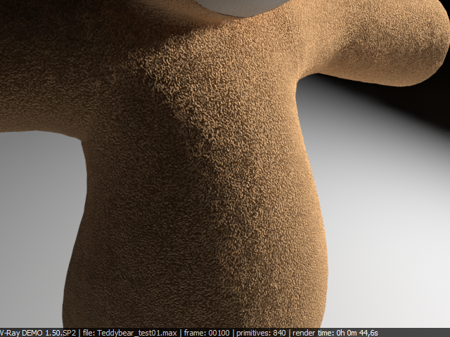
So I needed to create a hairy texture for the teddy. Something close to a standard teddy bear texture. In my head, there were 3 different methods of achieving the result we wanted.
Hair and fur - this would probably look most realistic. You would get physical hair, and a nice fluffy look. But I have never used it in a setting like this. I am not sure about the range of options within hair and fur. So if I wanted to use this, I had to learn it, try and fail a lot. Time I really don’t had. And maybe the most import reason why not to chose this one, render time.
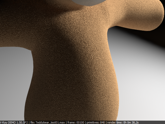
Displacement - to get small little hairs, you need a map that generates black and white dots, with extreme high contrast. The standard map called speckle did that. Here I needed to test a bit before I could make up my opinion. I saw that it looked good, and gave a feel of small hairs. The render time was not bad, but needed to compare it with bump.
Bump - I was thinking that this would give fewer details than the displacement would, but the render time would be better. I used the same speckle map in the bump slot, and got some results. From long distances you couldn’t see much different, but the render time was reduced to half. Close up, you could see some differences that were noticeable.
Conclusion - I did not even bother to try Hair and Fur, even though some wanted to see how it looked. It would have taken too much time of exploring and learning a whole new system. The displacement looks best close up, but from a long distance you cannot see much difference between bump and displacement. So I made two textures, one for close-ups shots where displacement is used, and one with bump, which could be used for long range shots.
Note: animation process has started and it seems that the speckle map do not like that. The texture is going crazy. It flickers and does not look good at all. I think that it is because the speckle map generates a so big contrast between black and white, that the small hairs gets too extreme. The light is not being bounced inside the hairs good enough, so this creates the flicker. We have to use a noise map in the bump slot instead. A cheap solution, but I think we can pull it off.
Experience:
Learned a lot of how important it is to get a smooth and efficient polyflow, and how to achieve it, and I saw how powerful the workflow of jumping from Zbrush to 3ds Max is. Really want to learn Zbrush now.
I have also learned that it is important to try and fail when it comes to texture. You need to know what you need the texture for, and how close you are going to see it. You can save much rendering time if you get the right textures in the right sizes.
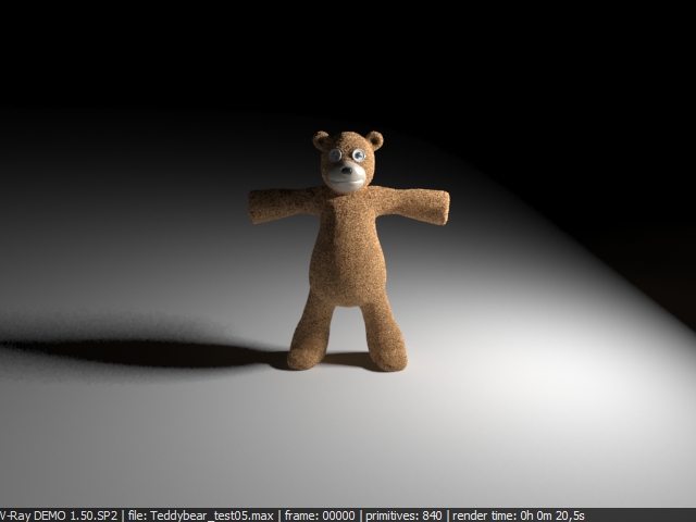
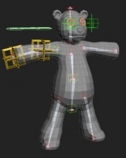
This was the part of the teddy where I was the most worried and felt unsecure on how I should do things. We talked a bit about it, and we knew that we needed a rig we could fully animate, since we have some close up shots where the teddy is falling or being picked up from the ground. But we also have some shots where the girl is running with the teddy, of course you can animate it with a standard rig, but we were looking at the idea of getting some automatic into it. Like a ragdoll type of thing.
My first priority was to get a teddy up and running with a standard rig. I have rigged a character before, but wasn’t sure on how to do everything, and it didn’t make things better when Knut wanted some stretch in some areas of the body.
I needed to ask our favorite rigger in the class, Sebastian Antonsen. He can rig everything, and for the most of the time say yes if you ask him for any help. He doesn’t just give you help, he explains things down to the smallest detail and keeps doing it to you get it. When I asked him about how to get a stretchy leg, he made me this VIDEO.
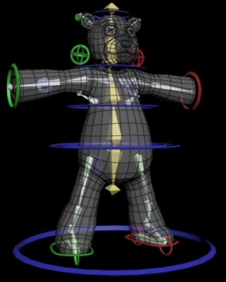
Everything else on the rig is pretty straight forward, unless the stretch in the spine. IK solvers on the legs and arms, and the eyes are made so they can bump back and forth a bit.
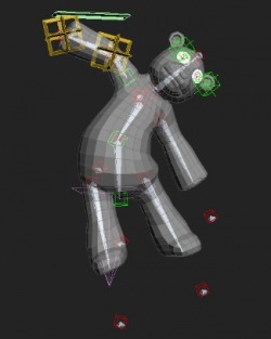
When that rig was done, I started looking for an optional rig that worked a bit more automatically and would make things easier when he is being carried around. I searched the internet for possible ragdolls options, but many of them needed to be simulated with reactor. And we have so much simulation already for the movie, that this would only make things take even a longer time. I had almost given up when Sebastian had sniffed up what I was looking for. He had already made me a prototype of what he was thinking about and showed me a GIF file of it. After that he told me what he had done, and let me have a go at it while he was sitting beside me telling me what to do.
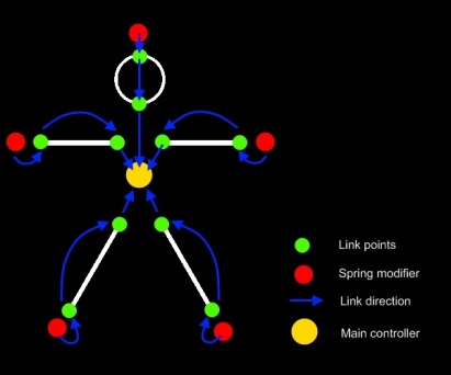
The main idea is that every limb that needs to be automatic thrown around got a spring modifier on it. To achieve a good result, we made the bone stretchy first, so the point would fall down and hang a bit under the limb. This would give a much more of a realistic result and you could add gravity to get even a better result. The only problem with this was that when a kid runs with a teddy bear, it is being dragged after the arm. As you can see here, the dragging point is in the middle of the teddy. I needed to move this up to the arm.
I have tried to show how we did it the first time with a simple drawing. Everything is rigged to the main controller in the middle. The spring modifiers are own LINK POINTS too.
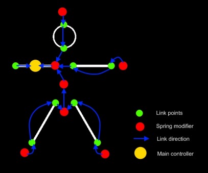
And here is what I ended up with after doing it all over again but by moving the main controller up to the arm of the teddy. The spot where the girl will be holding it when she runs.
That’s basically how I made it. I was really happy with it, but didn’t know how it would react when it is being put in the hand of the girl.
Note: I have tried it now, and after some readjustments it is working okey. Had to remove one of the flex points because it created the teddy to flip totally around when it are being drag back. Because of the missing spring point, the arm seems a bit stiff, so I will try to turn in on again, but then reduce the spring affection.
Experience.
This is the part where I feel I learned the most useful things even though I am not aiming for a career where I need to rig a lot. But I learned to think in a different way, and attack things in bit more efficient way. Been through how scripting can help me do repetitive things faster, how a rig can be done to get things to go more automatically and just how a basic should work when it comes to animation. Loads of small things I won’t mention now. A big thanks to Sebastian Antonsen for teaching me loads of things.
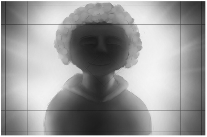
Here comes a post about what style we chose for our movie. It’s not a very big subject to write a lot about, but I feel that I should because it is pretty crucial to our movie. We never had a really big discussion about it, but very many small ones. This is because the style came very naturally for us because of the storyboard. It sat the standard and something to go after.
After Knut’s drawing of different styles for the girl we knew that we wanted to go for a semi-realistic type of style. Since many people interpret words and sayings their own way, I will try to explain what I see as a semi-realistic style.
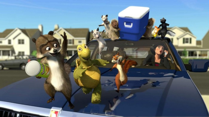
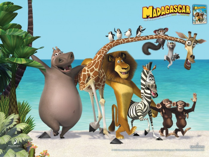
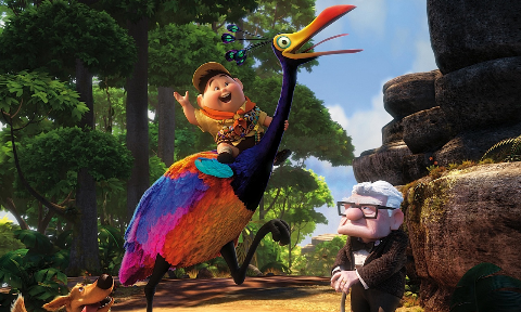
In the one end of the scale, you got what I see as the more cartoony ones. Like the Madagascar movies, Up and Over the Hedge. The animation is very cartoony, loads of squash and stretch and very exaggerated. The colors are very bright and clear and gives a total awesome look, but a bit unrealistic.
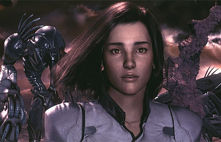
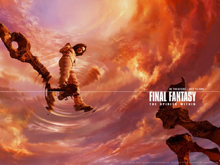
In the opposite end, we got the more realistic movies. Square Pixtures movie called Final Fantasy: The Spirit within. A Japanese movie that was released in 2001, and was aiming for making it as realistic as possible at that time. The main character Aki consisted of 400 000 polygons and had 60 000 hairs. And all was animated. They used a render farm with 960 workstations, something we don’t have. So this style is a bit hard to achieve for a couple of students.
Now that I have established that, it’s easier for you to see what I am talking about. Our main character, she gets a bit of realistic style. We are going to have a SSS (Subsurface Scattering) material on her, so the skin gets a realistic feel. But for the hair, we are using just a modeled hair, not realistic looking at all. But we are using a cloth modifier for the dress, to get a bit of a realistic feel there.
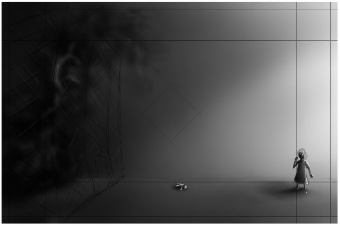
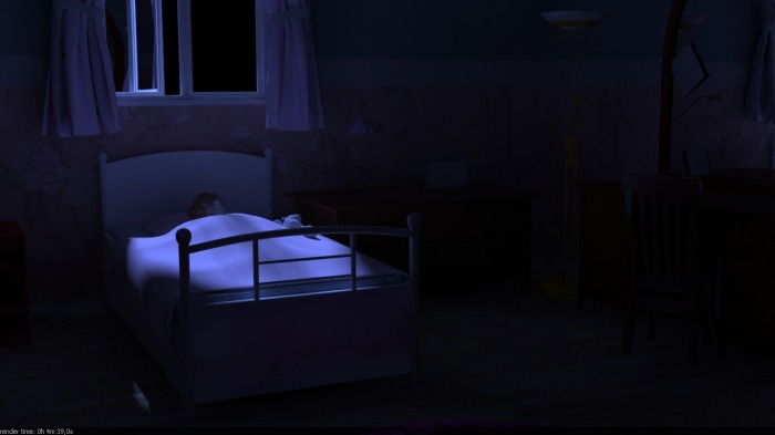
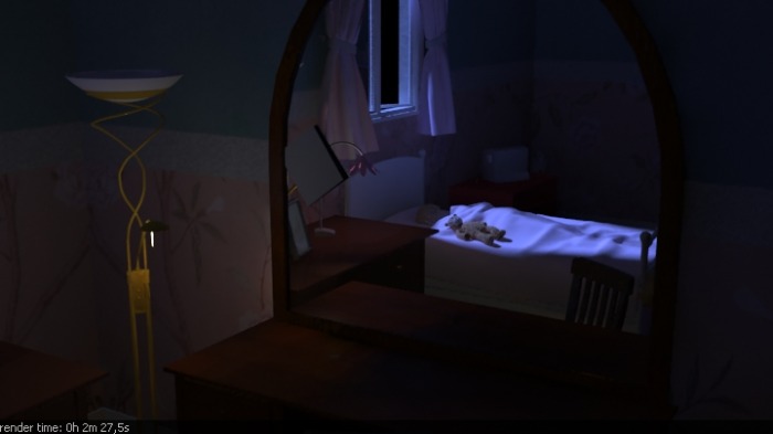
The first scene, her room, got some very bright colors and got a purple tone. Things are realistic modeled, but the height of the roof is not. We had to get more space between the floor and the roof to get the look we wanted. The lighting is a bit bright, just so you can see the smoke better.
Note: these are only test renders, not the finished thing.
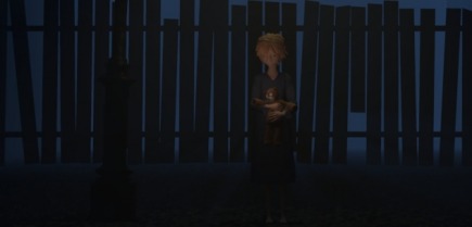
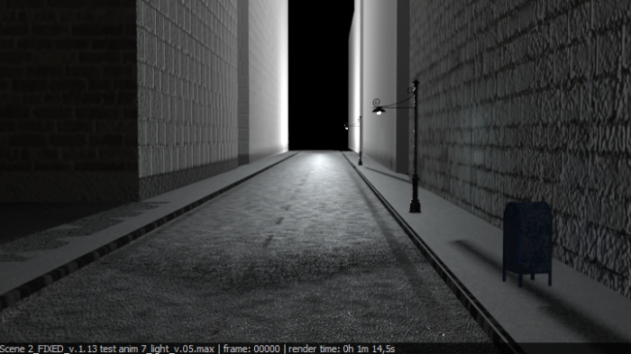
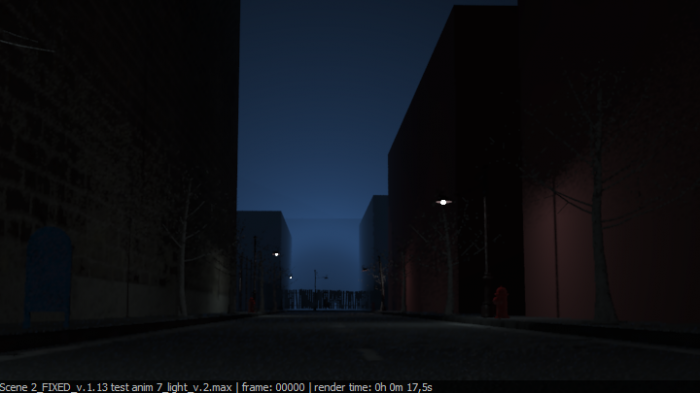
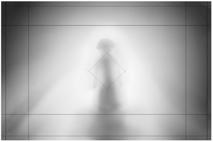
The scene where she is outside is going from realistic to really unrealistic. Since we did not want people to understand that she is in her imagination, we starts off with a bit realistic feeling to the texture and lighting. But when she is getting closer to what I refer to as “The Heaven Street”, it is getting whiter and whiter, and the things as lampposts and garbage containers disappears.
Note: these are only test renders, not the finished thing.
The animation can be done in many different ways, but here we are going for a much more realistic way of doing it. Although the girl and the teddy got possibilities to squash and stretch, we do not want to use them as much.
So, to wrap this up. Our movie is trying to be realistic in some ways but in others not. I think that we have managed to get the right feel with the style we chose. Something is always being changed in the last minute, but I think that we are pretty clear on what road we have chosen.
The day had to come. We needed a name, and had postponed it too long I think. At the start it was okey to work with a movie without a title. You really don’t care what it is named because you are so busy modeling, animating, and texturing. Why we needed a name now? Well, we are about 5 weeks from delivery, and it’s time to start to promote our movie a bit. Create some buzz. And it dosen’t really looks so good if you call the movie “working title” or “blank”. What is need of a title of a movie? Actually nothing. It’s only a word that people will remember if the movie was good, or extremely bad. But I think it’s good to have a title that suits the movie, and don’t send the audience in totally wrong direction.
As a take a quick glimpse at my DVD’s, I can see that it is not many poetic titles, but that doesn’t mean that it isn’t good. One common thing some of the titles are that is says specific something about the movie. For example, Saving Private Ryan and Kill Bill give you the goal of the movie.
Con air, The rock, and Fight Club. Not exactly creative at the best, but it is something you remember and suits a action movie well. The Last Samurai is a bit more poetic.
Well, want a title that is a bit poetic, strong, and that is easy to remember. I feel that one word title is best. But then it needs to be good. Long time ago we made a document where we could fill in name if we come up with something. Now it was time to clean the some dust away and open it. And oh, we had written loads of crap. But when you are supposed to find a name, you shouldn’t think too much. Just let the creativeness float and you will come up with a golden name in the end.
These are the names that we had written down:
Finding Life
Faith of Life
Life to be found
The darkness of life
Lifeless
Survive
Life
Survive Life
Not yet...
Facing Death
La Calma del Infinito
Beyond the Veil
The fear within
Return to me
A teddy tale
The Darkness in the Veil
Knowing
Allways waiting, allways with you
Plana del Infinito Calma
The epic journey of a little girl trying to find her way in the plane between life and death
We will meet again
I'll be waiting ( here, for you (i dunno?))
Some of these words did catch our eyes when we opened the document. Life, Death, Veil, Fear, Within.
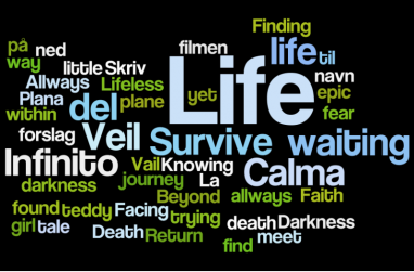
To help us a bit, we used a site called wordle.net. You throw a lot of words in, and get a nice picture back that contains all of your words randomly put together.
We wanted a name that told something about our movie, but didn’t reveal the story. If you kinda know what I mean? So the discussion went on, and we come up with a new list of names.
A. Infinite Knowing B. Fear of Life C. Lifeless fear D. Journey Beyond E. Veil of Life F. Beyond Life G. Faith Within Darkness H. Fear Within the Darkness I. Path beyond the Veil J. Strings of Love K. Truth beyond the Veil of Fear/Darkness L. Truth of life M. Fear beyond Knowledge N. Darkness of Life O. Lifeless Despair P. Calm within Faith Q. Fearfull Faith R. Love beyond Fear (Death...?) S. Truthfull Darkness T. Facing Fear Within U. Trails of life/death V. Fear within life/death W. Shadows of life X. Return of Light Y. Light of life/death
They name got more poetic and much deeper. But still, some of us wanted a name that was easy, and with punch. So our 3 last suggestions were:
#1: VEIL OF LIFE
#2: DESPAIR
#3: BEYOND FEAR
Down to 3! But it isn’t easy to choose even though its only 3. I felt that Veil of Life, was a poetic and deep name. It can’t be interpret in many ways, and that is why it is a good name. Despair are also a deep name, but much easier. I got punch, and look good. This was my favorite for some time. I think that Despair describes the feeling of the girl. Beyond Fear is not that poetic and deep, but it is more of an action title I feel. Its catchy, got action written all over it and it is a good title.
We couldn’t agree on a movie name, so we voted and Veil of Life won. It suits the movie well.
Well, I am back again. Seems like the posts must come fast now to get enough posts. Need 17 of em, and I got what, 5 or 6? Oh well. I got a word file that is getting bigger and bigger. Loads of notes that will be turned into blog posts.
So this post is first of all a post where I talk about blogging for this project, and how I do it. It’s something to talk about. Something that can be interesting.
It seems like my school want quantity instead of quality when it comes to post. Don’t get that. We need 17 posts and all of them need to be good. But 17 posts are not going to have the quality that is expected. 1 per week is a lot when you got the production to take care of, and a life outside the computer.
I have been told that I should divide my posts up, in not 2, but 3 or 4 posts because that will make it easier for me. But I am not chasing an easy ride to the end. Hard work is the only thing that get you somewhere in this world.
Of course I could divide up my posts, and be done without pushing myself. But I really feel that a post needs to be a certain length to be called a good post. My posts are not just an update on the movie, it’s a place where I try to explain, reflect and tell people about how we do it, and what I think. So I need a bit of length.
But, let’s face it. My blog isn’t exactly the most popular in the world. Don’t really think many are reading it, if any. But if people do, they will see that I really care about it. And I am not just writing to you, I am making myself tons of notes and workflows for different tasks. When I in the future am working on a big project, I will remember how we did it this time, and what was done wrong and can be done different. If I am not remembering it, I can just go back to my site and notes and read them.
So my reasons are many to continuing what I have started. I am certainly not dividing my post into smaller ones just to get quantity. If I only have enough work to write about, let’s say 10 posts, I am only going to write 10. Sure I am going to lose a grade, but that’s how I am. Kind of stubborn in that way. But I think that it will be no problem. Loads of subjects to write about later on. Got 2 posts just lying here, waiting to be posted. I just need to find some spare time to write them.
Here comes a post about the animatic and what we wanted to show with the camera angles and movement. Tried to keep it simple but explaining. You probably want to see the animatic once or twice before you read this post. Will save you for a lot of confusedness.
How we planned the animatic.
It started when we drew the drafts for the storyboard. We constantly chatted about the timing. Our group communicates well, so it wasn’t that big of a problem, and it gave Mats a good starting point. Mats did the editing for the animatic. When he had a finished draft of the animatic, the group watched, and gave feedback so he could make fast changes.
I feel that it was a very good way to work. We don’t waste time by keeping all of the group members busy with something one person can do, but it’s really important that all is 100% focused and concentrated when we take those important decisions on the timing. Not float around or have the mind somewhere else.
If we had a much greater amount of time, it would have been fun to let each group member make an individually animatic. Just to see more of what each person is thinking and how he wants shots and scenes to be timed.
The decisions
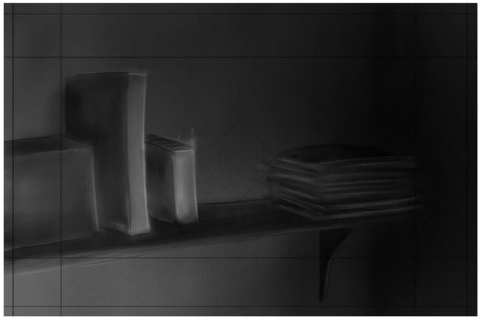
We want to give this movie a easy and calm start, where you get to know the character a bit, and some clues of that she is sick. The camera’s is paning and dolly inn and out to get the right feel. If the camera stands still, we don’t get the right flow in the start of our movie. If you look at the bookshelf from 16sec, you can clearly see what I mean. You get the feeling of that something is really important in that shot. This will be changed in the movie to a paning camera.
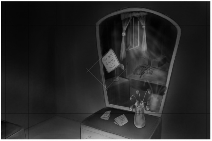
We show different side of the room, to show toys and books that can be connected to a girl in the age we want to. And we want to show small thing like a” get well” card and flowers to give the feel of that she has been sick for a log time. It’s important that people get a feel of who she is.
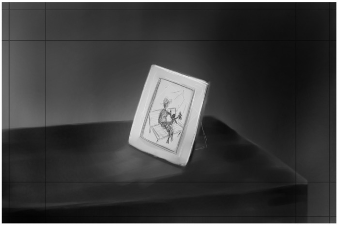
The last shot of the introduction scene is the picture of the grandma. We chose to have that shot last, so people will really see who it is and remember her when they see her again.
At the first draft of the animatic we didn’t have that fade to black form shot 4(grandma picture shot) to shot 5(girl lying in bed crunching the teddy). That made the introduction and the action blend together in a bad way. It’s like you didn’t get a chance to breath. Boom Boom Boom. But the fade to black fixed that, and you got a much better connection between those shots.
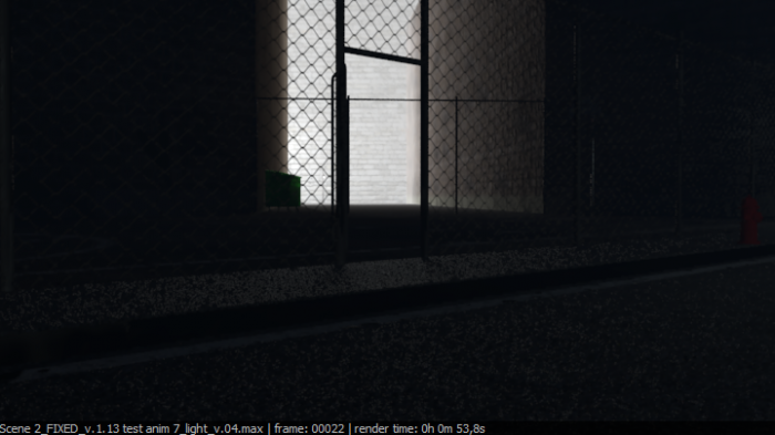
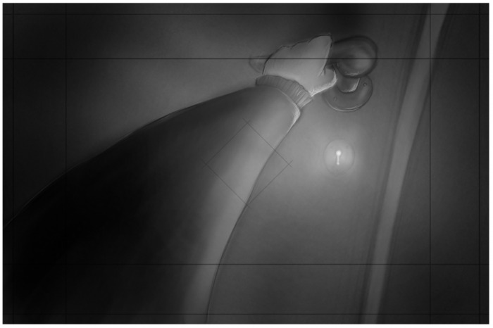
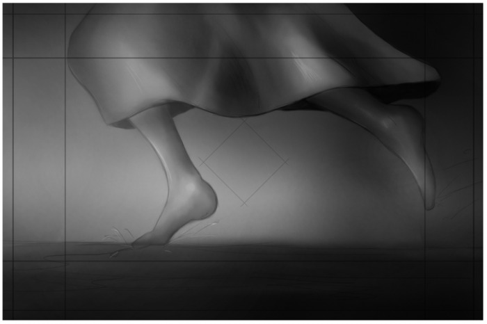
When the door opens, we chose to have a fade to white to get a nice cut. A hard cut after that to the running legs will be a powerful transition that will really make the viewers get their eyes up. We will have a couple of angles from the running scene to get the feeling of running for a long time, but try not to make it boring. Note: Middel picture should be rotated so she runs form left to right.
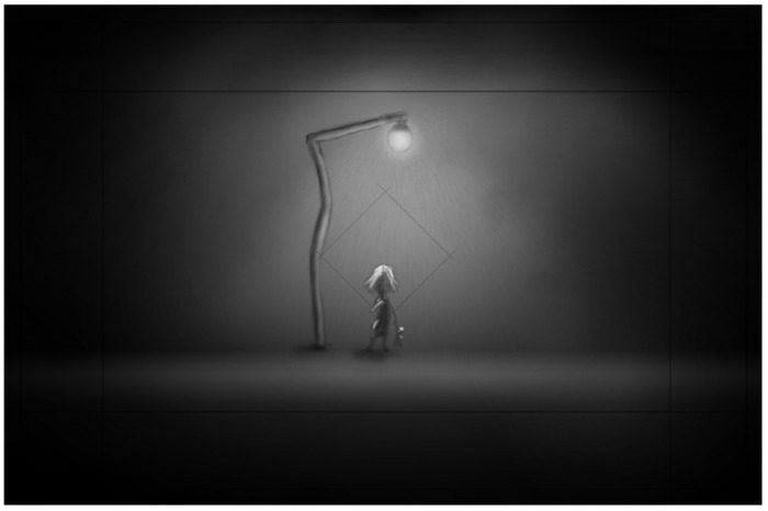
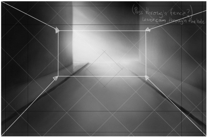
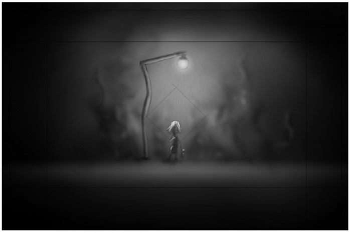
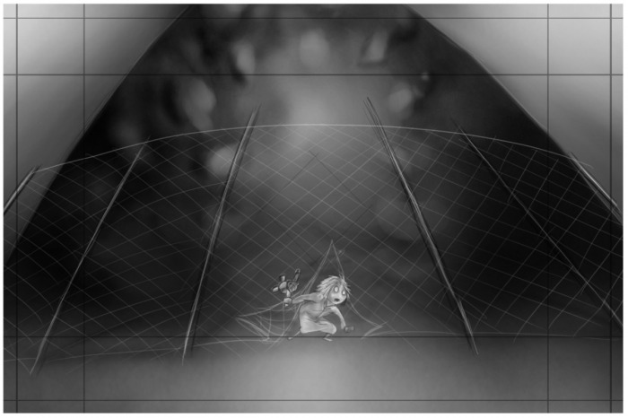
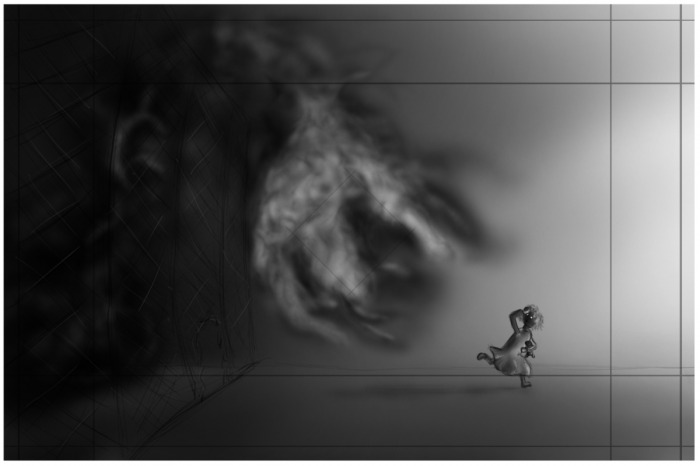
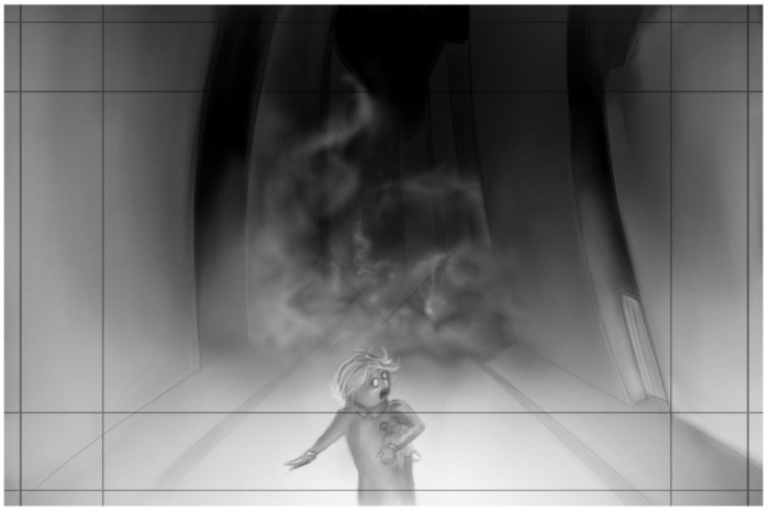
The shot where the smoke is appearing behind the girl, is pretty straight forward. When she stands under the light you get the feeling of here being really alone, and then she can see light ahead, but she needs to get through that fence. So now she got goal and an obstacle. We want a path camera or a dolly inn camera so we can show of some of the environment, and really show here she needs to go.
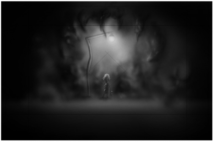
But then this “happy” moment are broken up by the smoke coming up behind her. We let the viewers see it before she does. That will hopefully make the viewer a bit worried about the girl.
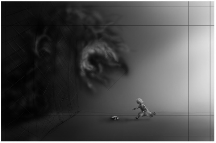
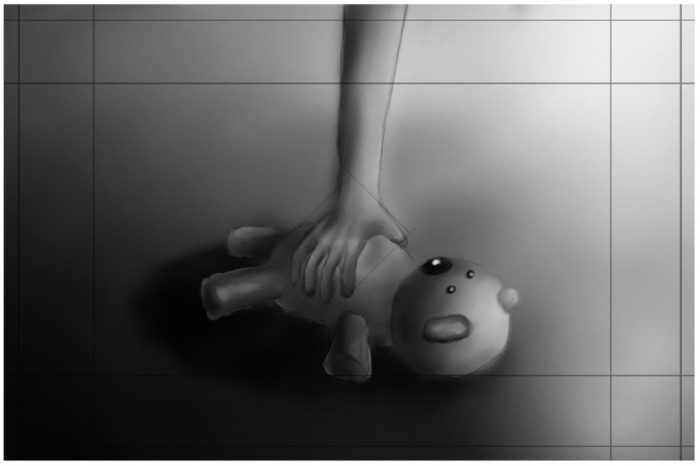
Then she has to run from the smoke, but teddy hooks into something from the fence and she loses it. We had to do a close up of the teddy to show it being hooked, and we got a low angel when she runs through the fence to get the feeling of the smoke being big and nasty.
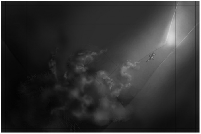
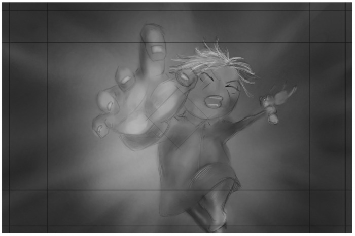
Her best friend and companion are lost. Will she save it? Of course. More pace here. She runs and grabs it just before the smoke catches here. At this sequence we swap from close ups to wide shots to get the right feeling of pace. The shot from above the building is just awesome and builds up to the next shot. That had to be concluded in our movie.
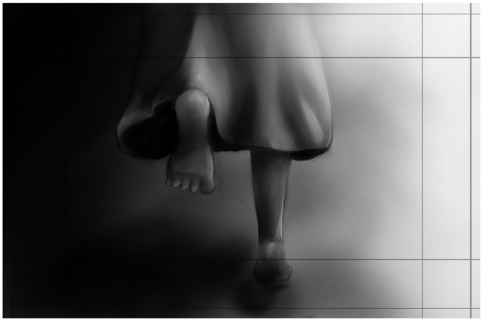
She runs around the corner, and you can see the smoke coming after her like a wave of water. Crushing upon buildings and really want to catch her. Her we want the audience to feel that she has to hurry because it’s getting closer and closer.
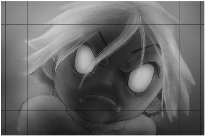
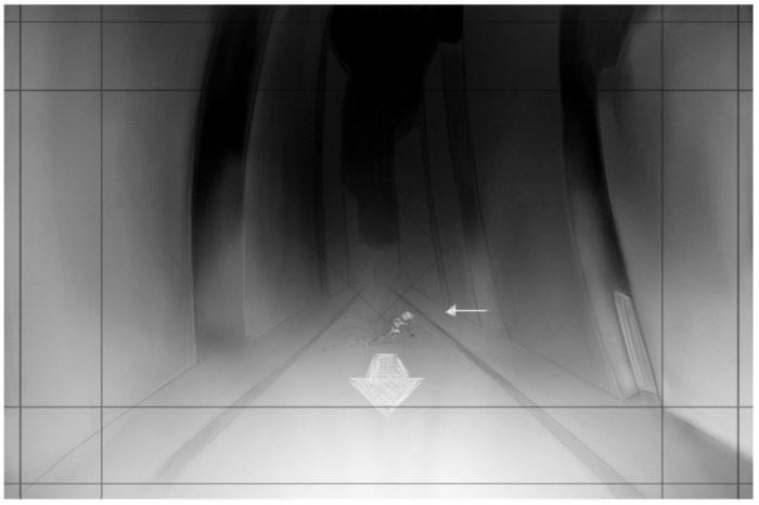
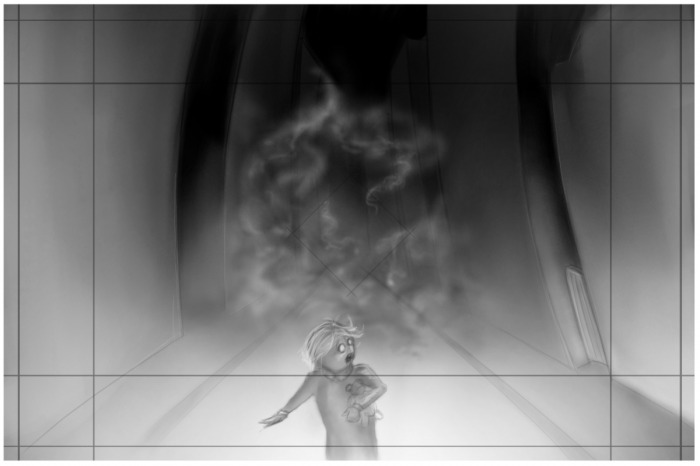
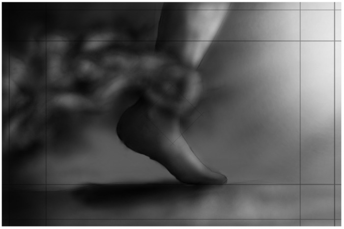
We swap through the goal and her. The pace is really necessary here. This should make people sweat a bit. Is she going to make it? Or is she not? We show a close up where she reaches for the camera. The tension here should be built up good. After that we swap to a close up of her ankle being taken by the smoke. To give it a smooth ending for this scene, we chose to let here being taken away from the camera just to amplify that she is didn’t make it.
Then end we are not so sure about, but we might do some changes. We want to show that it was her grandmother that she saw in the place between life and death. So we need to show the picture again. But we don’t want to show her mum’s face. Don’t want to model that face too.
Well, that’s what can be said about the animatic and storytelling.


 RSS Feed