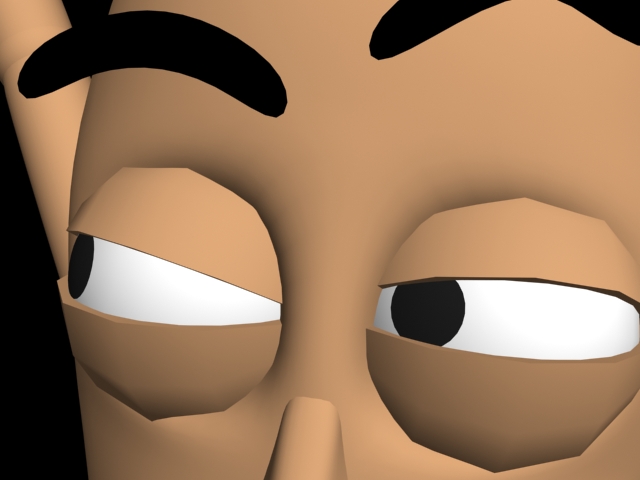
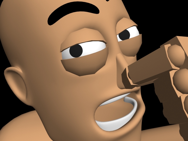
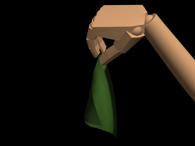
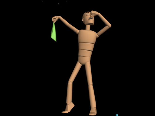
I was away from school last Tuesday it think it was, and my class had a classroom assignment that day. And I had some spare time at my hand this morning, so I went ahead and did it. The task was to pose a character with a stinky piece of cloth in his hands and render out 6 different views of that pose. We could not change the pose.
At school they went together into groups and acted a bit to see how people react when they got a something that smells like shit in their hand, but since I kinda late, I don't get that advantage. But HEY! I got a mirror, so I acted a bit for myself and had some fun. Here my 6 renders:
I am very happy with my result. Think the different renders shows a story and "guides" you through to the end. This was a really fun task to do.
For this project we had to find a pre 1960 story about gangs, and get influenced by it to draw a character concept. We also had to write a lot, who was a big difference from the last year at Noroff, but it's great to get to explain everything thing and try to write my thoughts down and share them with you.
The planning of the character
When I read the assignment text, and knew that we should make our own character based and influenced by some pre-1960 story about gangs, I just let my head wrap around it, and started to think. For about 3-4 days I just read and didn't stress at all. The Chinese Triads caught my eyes, so I started to dig deeper into it. Youtube had some great videos that showed me something interesting facts, and I read a lot about them at some different pages.
My first idea come when I read that some of the members of the Chinese Triads imported young girls. They abused them to they was in the early 30's, after that they were killed, let free or forced to be a member of the Triads. So my idea was to make a character based on a girl who was forced to be a part of the Triads. I drew a sketch, but I put the idea on hold for some days. The reason for that is that we have made characters before, and the result often get better if I don't go for the first and best idea I come up with.
After a couple of days, the idea didn't looked that interesting. So I turned my eyes to the Hashshashins, some sneaky and silent people. At the first I was so hooked on making a character based on them, but then again I was a bit skeptic. A assassin have been made so many times before and I wanted to go a new way I hadn't tried before.
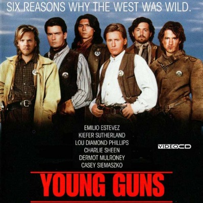
Now I started looking into the wild west and the good old times when the cowboys ruled the world. I was a bit tired of reading, so I lent a western movie from a friend of mine. Maybe I could get some idea's from Young Guns 2. It's a movie about Billy the kid, one of the most famous cowboys. The movie wasnt really super good, but light entertainment.
A bit into the movie, this teacher called "Doc" Scurlock popped up. He was working as a teacher when the past caught up with him, and he was arrested for some crime he had done. Billy the kid sat him free, because he had been in the gang to Billy before. But Scurlock had now a wife, and children and had settled down. He wanted to return them, but was chased by the sheriff. He had no other choice than once again be a part of Billy's gang to survive.
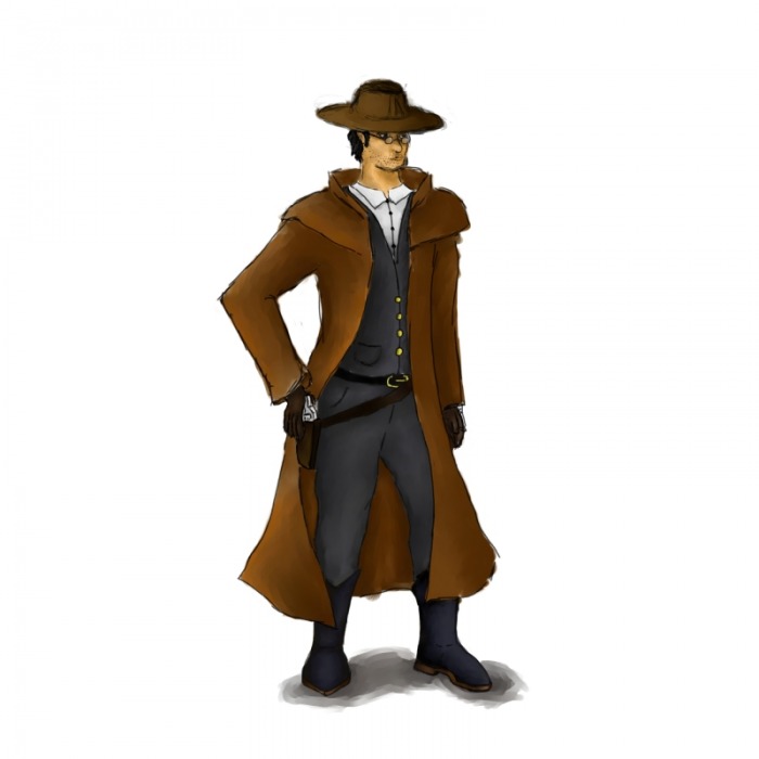
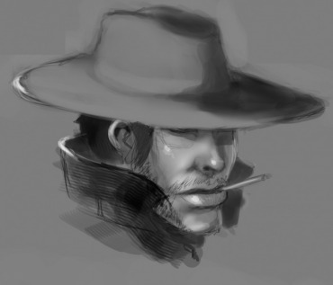
This Scurlock person gave me an idea. What happens when a upper-class man with great education have no other options than to join a gang of criminals? I liked that thought, so I started to read about him, and found out that his name was Josiah Gordon "Doc" Scurlock. Catchy name! He had studied medicine and had worked as a teacher. It was in the Lincoln County war that he met Billy the kid, they was both member of the Regulators. They was about a dozen of cowboys who wanted revenge for the murder of their boss, John Tunstall.
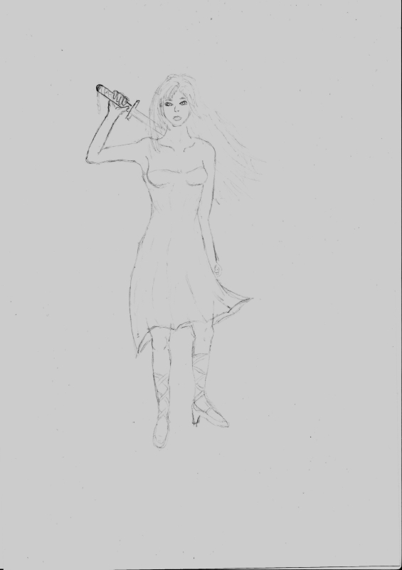
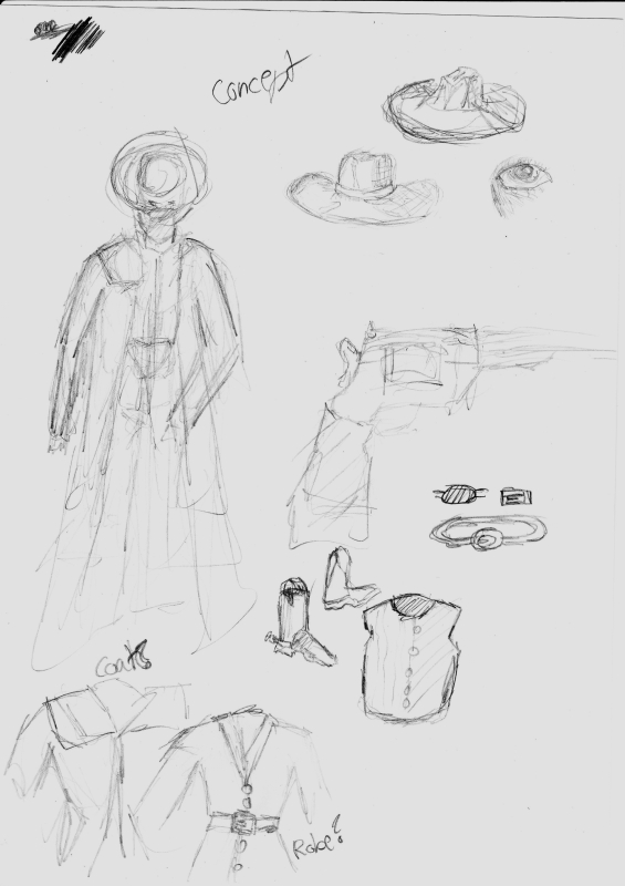
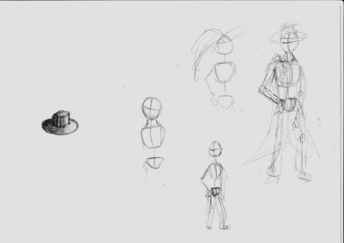
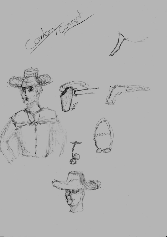
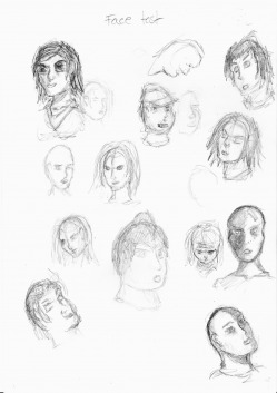
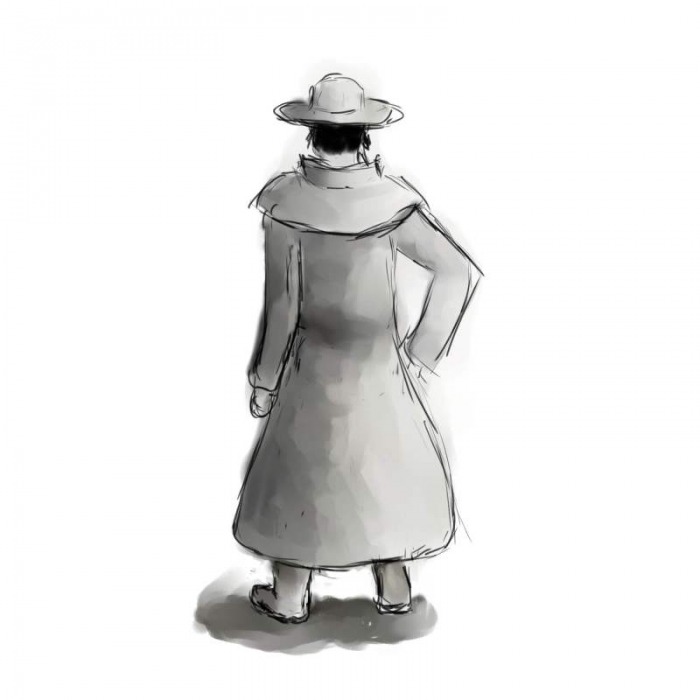
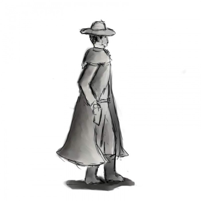
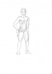
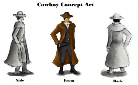
So my idea was born, and all I had to do was to give it life. I started finding some reference photos and started a long drawing process. At first I drew the pose on paper, and scanned it into my computer. I had just bought a Wacom Intuos 4 tablet, so to draw was a bit strange in the start. After that I drew some cloths and started coloring and shading it. Then I had to drew the face, hate to drew faces. I asked my classmate Remi Strand to help me out, so he showed me his way of working when he draws faces. This helped me a lot. When the front was finished I went on with the side and the back.
Face sketches
the pose
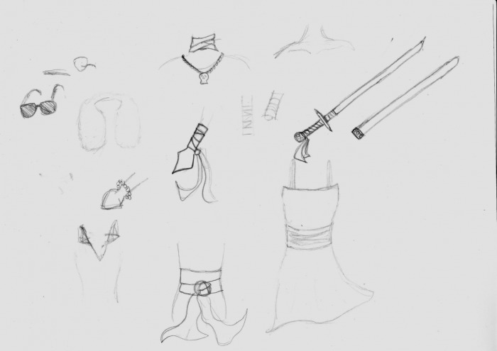
The color choice:
The color wasn't that hard to choose. I chose for the most bright colors who are easy to spot, so you will easy see different colors and the contrasts. I knew that I wanted a pair of dark pants and a matching dark west with a white shirt underneath. This is because he is a well dressed man. Almost looks like a modern-day suit, so people who see him will automatically see that he is nice dressed under the coat.I had to give him some golden buttons to show that he got some money. When it comes to the color choice of the coat, I knew that it had to be a light color because of the dark pants and the dark west.It will be a nice contrast and it has to be light to show that he is a good guy.
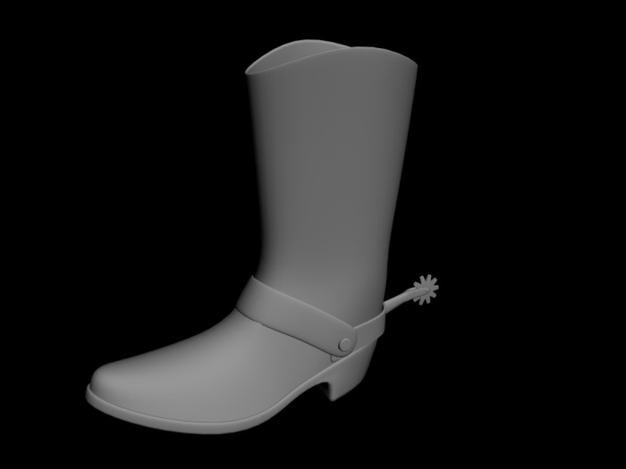
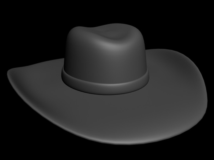
The boots and the hat, wasn't a "stand-out" clothing, so the color wasn't that important. Tested a bit around, and found out that dark color goes good with the pants. The hat got a normal brown color. I had to add the glasses so he gets the "nerdy" look. As he is educated in medicine and reads a lot.
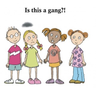
What's a gang?
For this project I had to write my interpretation of the term "gang". So what is a gang? The first I wanted to do, was to write down some things that I think of when I hear the word gang. I sat down with pen and paper and wrote a few words:
·Guns
·Death
·Drugs
·USA
·Fights
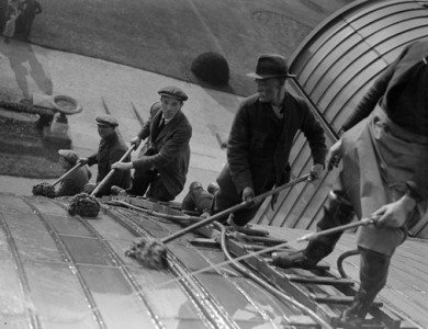
The first thing I saw, is that this was selection of very dark and sad words, but the truth is that many always connect the word gang with something negative. I started to read about gangs on wikipedia and found that the word gang was used about a group of workmen for a long time ago, and in United Kingdom it is still used sometimes. But the term gang are being referred to a group of workmen lesser these days because it have this negative affection on people.
Workmen in UK 1930
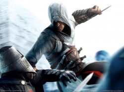
I read more and I have always been fascinated by the Hashshashins. They where a gang who tried to put an end to perceived corruption and greed in the early 13th century. Their method of working was really good, they had undercover "agents" who worked for some of the people with great power. If these people were corrupt or taking advantage of others, the agent just silently killed them.
One of the coolest Assassins Characters out here.
They list of typical gangs is very long. In good old western days it was a lot of gangs, but they often didn't last for more than a couple of years. This is because people got killed fast, put into jail and some just wanted to settled down. That is one thing who has changed through the last decades, if you are a part of a gang in the 21's century you can't get out. In USA it are loads of gangs who just want to protect the territory and gain new ones.
My interpretation of the term gang will be something like this: In the 21's century almost everyone think negative when they hear the word gang. This might be because the gangs who consist of good people and who just have fun, don't get any media coverage, but the bad ones always get it. I also think negative when I hear the word gang, but I also use it about people who are a lot together and plays and have fun. It have been gangs for a long time, and I think it always will be, the good and the bad. For me a gang is just a group of people who are together, but the reason for being together is different from group to group.
How did this research applied to my character design and presentation?
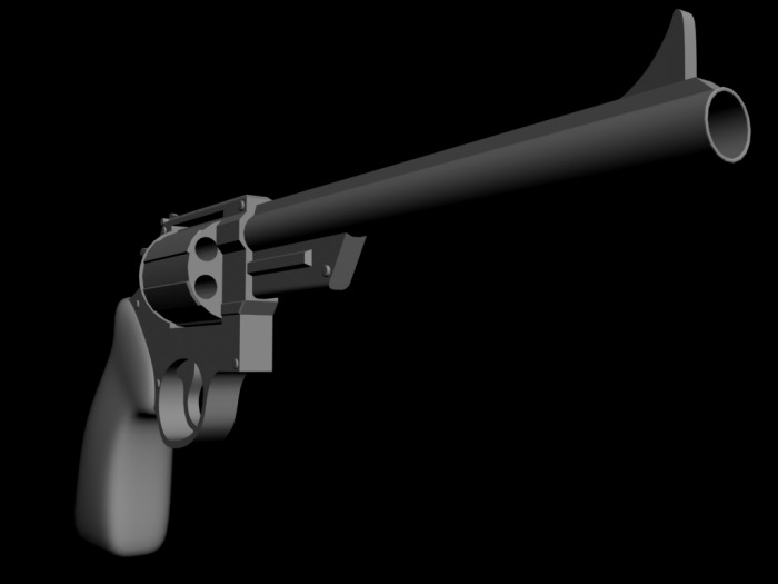
In these days, the gangs are known for wearing like colored bands or bandanas, but I chose a cowboy from the 1850's. And they wasn't that into clothing, and it was not as much clothes to chose from. So my character hasn't any clear gang items, but he got a revolver and the hat is a bit dragged down in his face. This will make him look a bit criminal, and the most criminals in the wild west was a part of a gang.
I didn't do very much research on cowboys, but I watched a movie, and saw how they were dressed there. Also used some reference photos that I found on the internet. I have fake cowboy hat home who I just took a brief look at before I drew it.
Doc Scurlock was the character and person who affected my choices of clothing throughout this project. He was educated in medicine and worked as a teacher, but was also a cowboy and a gang member before he settled down. I think it was really fascinating that he could be so educated and still go around and fight.
How do I expect an audience to read character based on the design choices?
I think that people will take a look at my character and understand that it is a cowboy. But when they take a closer look, they will see the more fine cloths underneath his coat and start think a bit. This will hopefully make them look even closer so they can see the glasses and the golden buttons. I hope that they will think that he got an education and a life besides being a cowboy, but he has been forced to be part of something he don't want to be a part of.
Since I have chose to have a light brown color at his coat, I think that they will understand that he is a good person. When they see that he got the hand at the revolver, I think that they probably will understand that he needs to use it for protection, but he don't want to use it.
How do I expect an audience to read my character based on the role of the character design in the chosen story?
My character don't have a stand out role in the my chosen story. He is for the most just riding together with some other cowboys. I have tried to showed that he don't are one of the persons who takes much responsibility and don't really want to be there.
Here is the link to my chosen story, its about Billy the Kid - http://books.google.co.uk/books?id=793gmWRK4OIC&printsec=frontcover&dq=the+saga+of+billy+the+kid#v=onepage&q=&f=false
How have my model sheet been adapted from my research?
I got an very good start by watching the movie. This helped me a lot, and shipped me off to a good start. It's a lot easier to design something, when you can see them in action, not just pictures and photo's. Young Guns 2 was a great research source and was the main reason for making the character I did.
It also helped me very much to read a lot about Doc Scurlock. I used this information to take my idea to another level. I collected a lot of reference photos to see who thing should look, but I always changed something about it to give it my own touch. Maybe the most effective research and reference was the coat my dad got. It's from Australia, but looks a lot like the ones I saw one photos and pictures. It's so easy to see things when its right in front of you, and when you can see it from every angle you want. If I had to model my character and animated it, I would had wear the coat, and see how it had behaved when I walked and so on.
Successful or not?
This was a great way of working. It was so helpful to have something to watch at when I needed to get inspired to design the different part of the character. The reference sheet was great, because I could write down notes and what I was thinking, and always keep it up to date. I could have used it a bit more I think. I think this was a successful way of working, and think I have shown that I have been influenced by my story, research and the references.
As this was my first drawing on the Wacom Intuos 4 tablet I wasn't influence very much when it comes to the way of drawing. I have developed an own way of drawing characters:
1.I sketch a lot and goes with the things I think look good.
2.Pose. I use a pen and paper and drew different sketches until I got one that looks good.
3.Clothes. I scan the drawings into my computer, and starts to draw clothes on top of it.
4.Coloring/shading. I shade and color every part of the character in different layers so I can easily change them and make the way that looks good.
I have probably been influenced by some of the guys in the class. When Remi Strands draws in the classroom, I always loves to watch the method he uses and I try to do something similar. He drew a cowboy head to show me how he draws a face. My classmates, Einar Martinsen, Alexander Edvard Fusdalh and Knut Eliassen also influence me in some way. 3 great drawers, all with their different drawing methods and style.
Remi Strand's drawing
Remi Strand - http://nakri.co.uk/GearFox/ Alexander Edvard Fusdahl - http://www.insanetk.com/ KnutEliassen - http://luvmachine.weebly.com Einar Martinsen - http://www.cgtorch.com
And so the models. Here are 3 renders, and you can also download the maxfile if you want to.
Just to sum up. This was a funny project, and I have learned that a reference sheet is very good for working on characters. If you use it, you get a full overview of the character and don't lose focus. I am really happy with how the final draft turned out. Andreas out.
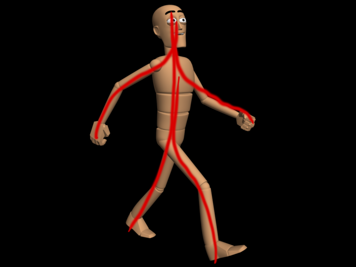
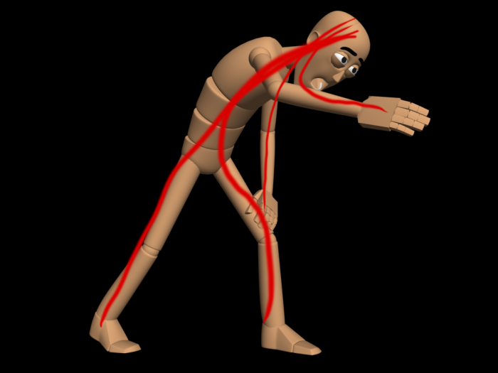
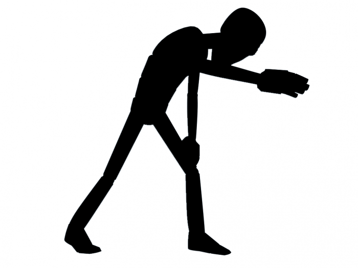
We got a task today, “Pose and Act”. At the start we had to make a GIF animation of two poses that are opposites of each other, like happy and sad, or hot and cold. We had about 1 hour, so I rushed off and had flying start. I look at youtube and google’d some pictures for references. So can u guess what i was going for?
So after we were finished with this we sat down in groups to discuss. The purpose of the group was to help each other to make the poses better. Some key words that were mention was “line of action”, believable, silhouettes, and extreme poses. I found the comments and critic very helpful, although it’s not the big changes that often has to be done to see a difference.
So as you can see on the pictures above, I just did some small changes to head and move the camera at the first pose so you see more of the person and still see the facial expressions. At the second pose, I had to do some more changes. The right leg had to be move a bit backwards to give the pose a bit more pose. And the left arm didn’t work, so I moved it down to his thigh so it’s resting there. I gave the spine a bit more bend and moved the camera down so the arm is leading up to the head. The head had also some minor changes, tilted a bit more down and changed the eye so they stilled look up and forward.
The silhouettes gives a lot more sense now, and you see what the character is doing.At the moment we can’t understand how to upload a GIF file, but when we understand it, it will come right up. For now you can download the first and the second version of the GIF animation at the bottom of this post.
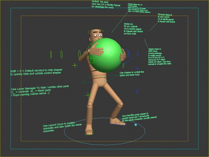
We have now started with digital acting, and our first assignment is to document the way we animate. So we had to animate a simple rig lifting a heavy object and then document everything from our research to our finished animation.
The first thing I do when I animate is to find some reference videos, usually from youtube. I just watch a bunch of them and try to see how the body works. For this task, Einar (my classmate) reminded me of the book called the animators survival kit, so looked up at page 256 where the main heavy lift is shown in the main poses.I also tried to lift a heavy object and tried to see how I was doing it.
First video I took a good look at. An old-style drawing animation.
A very funny and good animation. Studied this for a while:)
A real video of some crazy guy doing some stone lifting.
So after some research, I opened 3ds max and started with a biped. Doh! After some small crashes I gave up the biped for this time. I really didn’t want to work my way today. The LowMax rig was the solution. I haven’t used it before, but it was a dream working with, and quite easy to get to work.
I am guy who pretty much starts with the key poses and don’t care how it looks at start of the animation process. It’s the finished result that matters. After the key poses are finished, I see through the animation and see how the time between each pose is and move some frames around so get the right timing. After that I fix everything between the main poses. Then I often ask people around me how it looks and make some changes from the tips I get. That’s how I do it:)
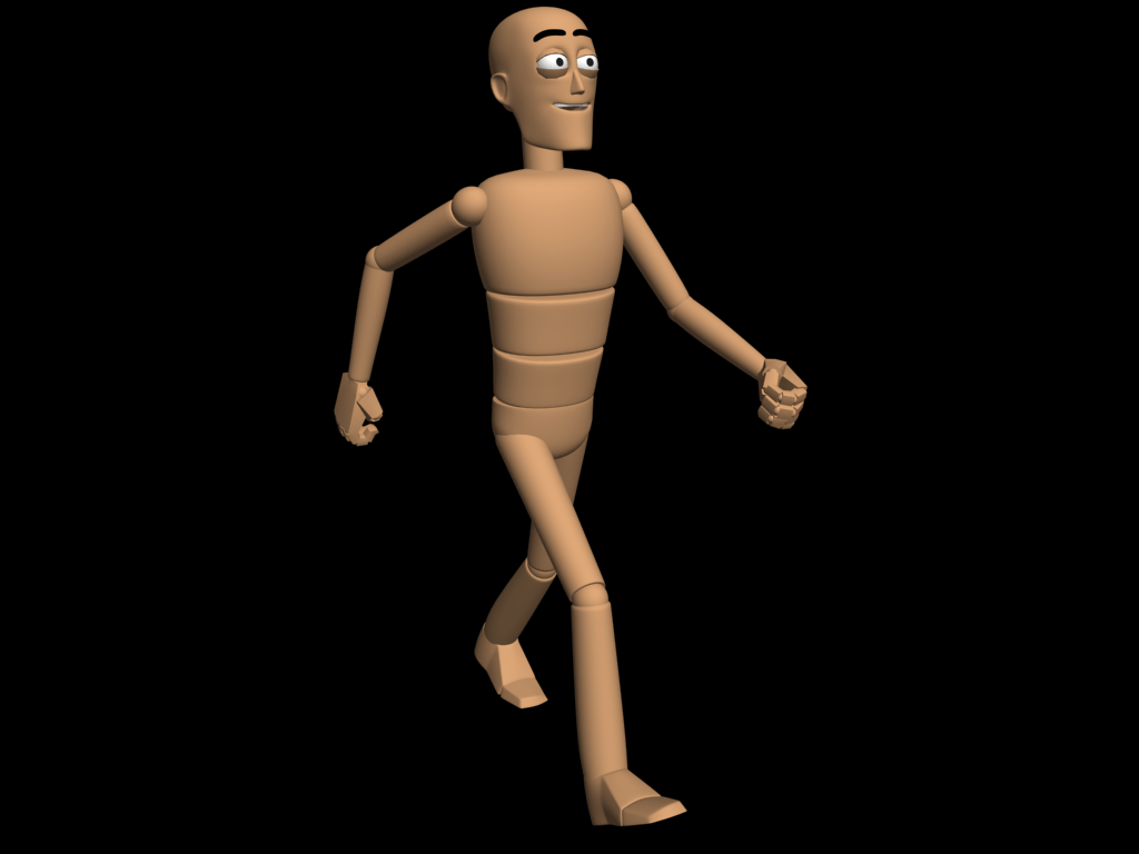
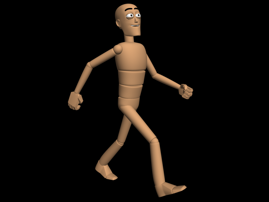
Here is the 6 key poses I used for this short animation.
Here is the finished animation of a basic lift. *Edit: seems like youtube dont play the whole ting. I have animated that he takes 2 steps back so it seems like the ball has some more weight.
Some of you know that we are going to make a short animation movie in the 2. semester. So had to find some short animation movies today “that show what you aim to do on the 3DFP course”.
I took a look at youtube and found some pretty interesting things and I also made a list of what my goal for my style is.
·Simple and good looking characters
·Really powerful colors
·A bit cartoonish
·Contrasts
·Playing with lights
I am going to start with explaining about the last point first. When I say playing with the light, I mean that I want the light to play a role in the film. You can take a look at http://www.youtube.com/watch?v=NVyDao6XISo . Here do the light have a big role in the movie, but I am not sure I want it to play that big role. Another example is http://vimeo.com/4354110 . I love the way how the light in the background behaves.
For the colors and he characters, I was think of something similar to http://www.youtube.com/watch?v=Km8MozN36Vc or the balloons in Pixar’s new movie “Up” - http://www.youtube.com/watch?v=USpI6Jzl3No . The colors and the light should set the mood of the movie, and really give a “happy” look. It’s a bit hard to explain, but I will try to give some examples and try things out when I got my computer, or we got 3ds max at school.
Well, this was just some thoughts about where I want to go, but I am sure that this might change later on. All I know that I want to experiment a lot. If some of you out there have any movies or pictures that might point me in any directions, please contact me and point them out for me. Thanks.
I like that the video is so simple, but it still gets your full attention. The music is like someone doing a “beat box” with his mouth and the music is a bit catchy. I love the way the sound is being used in this movie. It’s hard to try to follow all the dots at the end because the speed goes up.
I really can’t imagine where I would see this kind of movies. It’s like a short movie you could show to children just to keep them busy.
The first and main thing I notice with this video is the animation. It’s fast and funny and makes the video fun to watch. This is clearly a children’s program, and I think the modeling is done when they have that I their mind. The models are simple but nice looking.
As I mentioned, I think this is a movie or series that will be shown at TV for the children.
I just love the look of the movie. Brilliant! It’s a bit real looking, but still a very cartoonish look. The animation is really good too. It fits the look and makes the movie very cool to watch and the story was funny and makes you laugh a bit.
At the start I didn’t get the point, but when you watch I over again, you understand more and more. But it is a bit too long for my taste. What I like about this movie is the start when he looks back and when we take a dive into his head, at 00:47. It’s like a shocking effect and you really start pay attention. I don’t know why, but I like when it’s black and white and the colorful things comes around his head. Maybe it’s the contrasts.
I think the start is a mess. It goes so fast and I quite can’t see what I am looking at. But the music matches very well. I like when it stops up and everything is a new style and the animation is slow. Really good looking.
I like that the tree has so clear colors, while everything around is a bit blurry. And while the tree grows big, the environment around it gets some color too. Cool concept! The camera movement is cool as it rotates around the tree the whole time and you never take the eye of it. Our teacher pointed out that he liked the aerial view in the last shot, and I share that opinion.
It is great to be back in school again, and we go right work. Our first assignment is to get a website up and running so you people out there can see what we do and our previous work. I am looking forward to get some more stuff out at this page.
So, how did I get here? Well, it all started with my grandpa. He was really interested in drawing so I decided to be an architect in an age of 10 or so. I was studying Technical Draftsmanship (finished in 2006) and used Autocad, a program from Autodesk. We pushed the program to the limit and tried to make cool 3d objects, but the program wasn’t for that purpose. So I started to search for program where you could make 3d art, and found 3ds Max. I was hooked on learning more, so I started to study 3d design and animation at Noroff (finished in 2009). Learned a lot that year, and now I have started at my second year at Noroff.
I use 3ds Max for the most of the time, but I am looking forward to take a big dive into many other programs this year. I am very interested in effects, so I can’t wait to start learning Aftereffects and learning more about different ways of making effects in and outside 3d studio max.
The Transformers movies are the most exciting movies made in the last year if you ask me. I love the effects and story is good too. I am also very fond of the Lord of the ring movies because of the big battle scenes.
I feel that my skills in 3d are good enough, but I feel that I need that last edge to be good enough to work with 3d at the moment. I could use some more experience I think. So this year I am going to work hard to find my way of doing things, and I hoping to learn a lot .


 RSS Feed